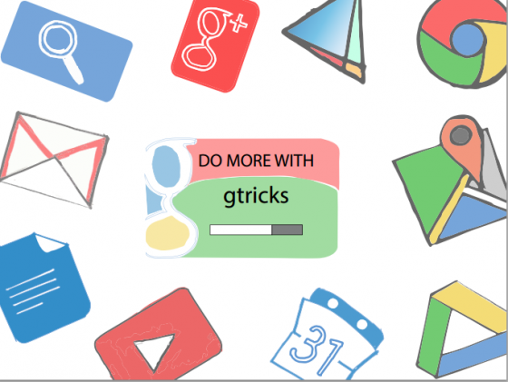
These are the rough concepts based on our mission to provide useful tips on Google products. Once selected, the chosen banner will be redrawn with clean and sharper logos. (Click to open any image in full size) The current banner:
Concept banner 1:
Concept banner 2:
Concept banner 3:
Concept banner 4:
Concept banner 5:
Design ideaology In the quest of a new visual identity, these banners were designed with few principles in mind: #. The banner should focus on Google products and Gtricks relationship with them. #. “Good design is obvious, great design is transparent” by Joe Sparano as the design driving factor. #. The logos should be hand-drawn. It represents our nature of adapting Google services — not as-is but with a slight tweak. #. A first-time user should instantaneously understand what Gtricks is about and a repeated user should directly navigate to new articles. #. There should be a call to action button for subscribing to latest posts through emails. Appreciating your comments: From your comments and mails about the recent design change, I have improved the readability by increasing line height, gave shadows to images for better contrast and simplified the category pages. Now again, for the visual enhancement, I would like to hear your feedback on these banners. After all, you all are part of Gtricks. Share your comments from the below comment of or through the contact page.


